

How To Create Tabs In Html Without Javascript
Tabbed Interfaces Without JavaScript
More and more fancy interface features rely on JavaScript to create— and therefore create accessibility problems with —how they work. Even when today they no longer require JS to be implemented. CSS3 has brought some serious power to us as developers, allowing for modal dialogs, "hamburger" mobile friendly menus, and even tabbed interfaces to be implemented without a single line of JavaScript.
What's Wrong With Using JavaScript?
In and of itself nothing, so long as it is not your only means of providing usability/functionality on a page. As I said in a recent article, good JavaScript should enhance an already working page, NOT be your only means of it working.
If basic functionality does not work when scripting is blocked, disabled, or otherwise irrelevant, you are not WCAG compliant and therefore risking prosecution or civil litigation under laws like the US ADA or UK EQA. Screen readers (software that reads the page aloud), braille readers, search engines, and other non-visual user-agents have difficulty with — if not outright cannot access — pages that use JavaScript for everything. Many users also block it out of distrust, or work in places where it is disabled on purpose. JavaScript should not be your go-to technology as the solution to every flipping problem client-side!
Again, not saying you can't use JavaScript, but it should ENHANCE the user experience, not be the only means of providing it.
So How Do We Implement Tabs Without It?
That's actually pretty easy thanks to CSS 3 and the "new" (if a decade as of 2020 can be called "new") :checked, :nth-child, and the General sibling combinator. Basically, we "abuse" <input type="radio"> to accomplish this.
The real magic comes from that if you click on a <label> where the for="" attribute points at an input, it's the same as clicking on that input! As such we can place our labels in a list for proper semantics, separate from and after their inputs.
Everything will go into a <div class="tabset"> so that we can easily target everything without slopping classes all over the markup for no good reason.
The Markup
First our inputs:
          <div class="tabset">
            <input
            type="radio"
            name="tabset_1"
            id="tabset_1_description"
            hidden
            aria-hidden="true"
            checked
            >
            <input
            type="radio"
            name="tabset_1"
            id="tabset_1_statistics"
            hidden
            aria-hidden="true"
            >
            <input
            type="radio"
            name="tabset_1"
            id="tabset_1_reviews"
            hidden
            aria-hidden="true"
            >
            <input
            type="radio"
            name="tabset_1"
            id="tabset_1_contact"
            hidden
            aria-hidden="true"
            >
They all get the same name to function as a radio set, with unique ID's for each. I like to use the name as a prefix to the ID.
They get "hidden" so that when our screen media CSS is inapplicable/irrelevant to the UA, they are ignored. I further set aria-hidden="true" so that should the screen media CSS get applied to aural/speech (NOT supposed to happen, but some UA's are trash) they will still be ignored. Remember, concepts like tabs are for screen media only.
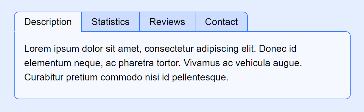
Next is our list of labels that will become our "tabs".
          <ul hidden aria-hidden="true">
            <li><label for="tabset_1_description">Description</label></li>
            <li><label for="tabset_1_statistics">Statistics</label></li>
            <li><label for="tabset_1_reviews">Reviews</label></li>
            <li><label for="tabset_1_contact">Contact</label></li>
</ul>
These too are "hidden" both by attribute and aria-hidden. A simple list of choices (the proper semantics, if you omit the UL/LI some UA's will think it's a run-on sentence of gibberish). Again the magic being that clicking on these labels is the same as clicking on the input these are "for".
Our tab content can then be treated as <section> inside a <div>.
          <div>
            <section>
            <h2>Description</h2>
            <p>
            Lorem ipsum dolor sit amet, consectetur adipiscing elit. Donec id elementum neque, ac pharetra tortor. Vivamus ac vehicula augue. Curabitur pretium commodo nisi id pellentesque.
            </p>
            </section><section>
            <h2>Statistics</h2>
            <p>
            Sed ut leo in turpis efficitur convallis at bibendum erat. Curabitur in egestas ex. Etiam efficitur sagittis molestie. Praesent condimentum elementum ipsum sit amet euismod. Sed vestibulum, leo ac iaculis fringilla, felis nulla placerat turpis, eu aliquam elit risus vel tellus.
            </p>
            </section><section>
            <h2>Reviews</h2>
            <p>
            Donec non nunc ac augue ornare aliquam. Aenean sed volutpat arcu. Sed molestie lacus placerat nisl gravida condimentum.
            </p>
            </section><section>
            <h2>Contact</h2>
            <p>
            Nullam nec condimentum lacus. Integer dapibus velit nec ipsum varius, a pharetra arcu imperdiet. Donec pretium libero a tincidunt vulputate. Mauris feugiat tempor lectus, quis placerat mi congue sit amet.
            </p>
            </section>
            </div>
            <!-- .tabset --></div>
Each one getting a <h2> to describe the section for non-visual UA's. If we want, we can hide these headings in our screen media stylesheet.
Styling It
All this code will also assume that some form of "reset" is in use. First, we need to target the input so that they are no longer "hidden" by the attribute so we can still have keyboard navigation, whilst simultaneously still being hidden. This also fixes a bug where IE won't change the state of an input that has the hidden attribute on it unless you set it visible with display.
          .tabset > input {
            display:block; /* "enable" hidden elements in IE/edge */
            position:absolute; /* then hide them off-screen */
            left:-100%;
}
Next is our unordered list.
          .tabset > ul {
            position:relative;
            z-index:999;
            list-style:none;
            display:flex;
            margin-bottom:-1px;
}
The position:relative; and z-index:999; is for a "trick" we can use to make the tabs overlap their bottom border with the tab frame. To put all the labels on one line we could use inline-block or floats, but these days flex is just so much easier!
As all our <label> and the <div> frame around the content tabs share the same border, it's a no-brainer to declare them together.
          .tabset > ul label,
.tabset > div {
            border:1px solid hsl(220, 100%, 60%);
}
Note, I've been using HSL lately, it's actually easier to reskin your whole colour scheme as you can just search/replace "hsl(220" with whatever you want… or use CSS variables to assign it.
The labels:
          .tabset > ul label {
            display:inline-block;
            padding:0.25em 1em;
            background:hsl(220, 100%, 90%);
            border-right-width:0;
}
…are set to inline-block so they obey padding top/bottom. You could set this display:block instead, but since they're on a single line I feel more comfortable with inline-block. YMMV. Note they remove the right side border. We'll get to that shortly.
          .tabset > ul li:first-child label {
            border-radius:0.5em 0 0 0;
}
Round the corner of the first one.
          .tabset > ul li:last-child label {
            border-right-width:1px;
            border-radius:0 0.5em 0 0;
}
Round the top-right corner of the last, then re-apply the right border. Boom, no double-border between elements, and the first/last ones getting some light rounding.
          .tabset > div {
            position:relative;
            background:hsl(220, 100%, 98%);
            border-radius:0 0.5em 0.5em 0.5em;
}
The <div> wrapping our <section> tags gets a lighter background and rounding on all but the top-left corner, where it sits flush with our tabs.
Now the "complex" part begins. First we should have a style applied to the label when keyboard navigation occurs. A simple underscore on :focus can do the trick. This will look complex, but it isn't.
          .tabset > input:nth-child(1):focus ~ ul li:nth-child(1) label,
.tabset > input:nth-child(2):focus ~ ul li:nth-child(2) label,
.tabset > input:nth-child(3):focus ~ ul li:nth-child(3) label,
.tabset > input:nth-child(4):focus ~ ul li:nth-child(4) label,
.tabset > input:nth-child(5):focus ~ ul li:nth-child(5) label,
.tabset > input:nth-child(6):focus ~ ul li:nth-child(6) label,
.tabset > input:nth-child(7):focus ~ ul li:nth-child(7) label,
.tabset > input:nth-child(8):focus ~ ul li:nth-child(8) label,
.tabset > input:nth-child(9):focus ~ ul li:nth-child(9) label {
            text-decoration:underline;
}
Now, this limits us to only supporting up to 9 tabs, but honestly if you have more than 9 tabs it's probably time to consider using a different interface style, possibly breaking it into multiple pages. You rarely see more than 5 tabs on a website for good reason.
The logic is actually simpler than it looks. Let's look at just one selector:
.tabset > input:nth-child(1):focus ~ ul li:nth-child(1) label, Inside .tabset when the first input is focused, the label inside any adjacent unordered lists's first li will get our style. That's really all that says. This means that when you focus an input (keyboard nav or click on it), the associated label will get an underscore. We repeat this for however many tabs we want to support at maximum.
We can then repeat this pattern for when the input are checked.
          .tabset > input:nth-child(1):checked ~ ul li:nth-child(1) label,
.tabset > input:nth-child(2):checked ~ ul li:nth-child(2) label,
.tabset > input:nth-child(3):checked ~ ul li:nth-child(3) label,
.tabset > input:nth-child(4):checked ~ ul li:nth-child(4) label,
.tabset > input:nth-child(5):checked ~ ul li:nth-child(5) label,
.tabset > input:nth-child(6):checked ~ ul li:nth-child(6) label,
.tabset > input:nth-child(7):checked ~ ul li:nth-child(7) label,
.tabset > input:nth-child(8):checked ~ ul li:nth-child(8) label,
.tabset > input:nth-child(9):checked ~ ul li:nth-child(9) label {
            background:hsl(220, 100%, 98%);
            border-bottom-color:hsl(220, 100%, 98%);
}
Making them the same color and bottom border as our content <div> makes it look like the tab is "on top". That's where our -1px bottom margin comes into play.
So what about showing/hiding the content <section>? First let's hide the sections.
          .tabset > div > section,
.tabset > div > section h2 {
            position:absolute;
            top:-999em;
            left:-999em;
}
I use the same code to hide the H2 off screen. A big problem with screen readers and some other non-sighted UA's is that they'll often not read content if you set them to display:none; or visibility:hidden; Search engines in particular will oft obey screen media behaviors when they shouldn't in their search for dirtbag black-hat SEO scam artists trying to use the "content cloaking" trick. By sliding it off screen we at best avoid the issue entirely, at worst get flagged for a manual review where any competent person at Google will go "yeah, this is fine".
When possible, be it scripted or CSS driven, try NOT to use display:none on major content sections! You're risking the content being ignored by search and other non-visual user-agents.
Next I set a nice all-around padding on the <section> everywhere but bottom. I prefer to pad instead of margin to avoid "collapse" headaches, and if you pad the bottom of content elements then pad all other directions of the parent, it's just easier to deal with.
          .tabset > div > section {
            padding:1em 1em 0;
}
Then we implement the same selector logic as with the <ul> to switch the <section> to display:static;
          .tabset > input:nth-child(1):checked ~ div > section:nth-child(1),
.tabset > input:nth-child(2):checked ~ div > section:nth-child(2),
.tabset > input:nth-child(3):checked ~ div > section:nth-child(3),
.tabset > input:nth-child(4):checked ~ div > section:nth-child(4),
.tabset > input:nth-child(5):checked ~ div > section:nth-child(5),
.tabset > input:nth-child(6):checked ~ div > section:nth-child(6),
.tabset > input:nth-child(7):checked ~ div > section:nth-child(7),
.tabset > input:nth-child(8):checked ~ div > section:nth-child(8),
.tabset > input:nth-child(9):checked ~ div > section:nth-child(9) {
            position:Static;
}
One thing to remember about display:static; is that it basically ignores all positioning rules. This pops the currently selected section into view without having to change any other properties.
Which is good for a quick and dirty implementation. You could get more complex with this, like leveraging display:flex; on the <div> and using position:relative to slide them all into place, opening the doors to fancy animations and the like.
Finally as these are label driven, and you're clicking on those labels, there's the issue that clicking quickly or accidentally dragging whilst clicking can select the text in an unwanted fashion. Also if someone goes to copy/paste from the page, you might not want those labels in the copy since they're redundant to the H2… which would copy. Hence:
          .tabset > ul label {
            -webkit-touch-callout:none;
            -webkit-user-select:none;
            -khtml-user-select:none;
            -moz-user-select:none;
            -ms-user-select:none;
            user-select:none;
}
Stops those labels from being selected. It might SEEM like using all the browser-prefix versions is wasteful and unnecessary, but if you check "Can I use"
You'll see the compatibility table says that all versions of IE need -ms-, all versions of Safari still need -webkit-, the -moz- version was only "recently" removed and with them dropping new build support for certain older OS that's a cutoff we still have to worry about, etc, etc.
But really that's all there is to it.
Live Demo
Here is a working example:
The file directory:
https://cutcodedown.com/for_others/medium_articles/tabsWithoutJS/
Is wide open for easy access to the gooey bits and pieces. I put a .txt of the markup in there for those shy of "view-source", and there's a tabs.rar file containing the full code for easy download.
Pay attention to the keyboard functionality. Hit [tab] until you see the underscore on one of the tabs — or click on one to focus it — and then try the arrow keys. When any of the radio buttons receives focus, you can use the arrows to switch between them.
Pros and Cons
Unlike many out there, I like to list off the problems first.
Disadvantages
- You are reliant upon more modern browsers for this to work. It should function well in everything ≥ IE 10. These days I'm getting in the habit of just blocking CSS and letting things gracefully degrade to my semantic markup in legacy browsers.
- For each additional tab you have to add 3 lines of CSS for it to be supported in three different places. This can get unwieldy, but really if you need more than nine of them you probably shouldn't be making a tabbed section of a website.
- This implementation doesn't take a dump on the markup with endless pointless classes for nothing. This may upset some developers who can't handle selectors and believe bald faced lies like how endless pointless classes for nothing resulting in two to twelve times the markup needed to do the job somehow magically makes "the render faster". Wait, that's a disadvantage? Sadly to many — let's call them morons — it is.
Advantages
- The basic structure of the content <section> is the proper semantic markup, which means better usability for non-visual UA and alternative navigation.
- It doesn't rely on JavaScript for all its functionality, so unlike other methods it is not a walking talking WCAG violation.
- CSS off in any modern browser all our UI controls disappear leaving us with a proper accessible structure.
- As it is 100% CSS controlled, you can expand on this with CSS transitions, animations, or any other effects you might be able to think of.
- It doesn't piss all over the markup with made up fairy-tale non-semantic tags, endless pointless classes for nothing, and other "eye cans haz teh intarwebs" developer stupidity.
- The use of the "hidden" HTML 5 attribute and the
aria-hidden="true"role make it so screen readers, braille readers, users viewing without CSS, and the like ignore all the excess markup used to create the tabs, browsing the page as if it were just normal sections with headings. - It's usually far less code than you'd have using any of the monuments to developer ignorance, incompetence, and ineptitude that are front end frameworks.
Conclusion
"Abusing" <input type="checkbox"> with the :checked CSS property and the general sibling combinator ~ can let you avoid a lot of scripted silliness in a manner that avoids most accessibility woes. "JavaScript only" solutions to problems should be avoided, and we finally have the tools to do so!
I hope you found this useful, and seriously folks: Put more thought into the accessibility of your sites, particularly in regards to what happens when there's no JavaScript. You'd think Beyonce and Domino's getting raked over the coals in court over issues like this would be serving as a wakeup call for developers who work for actual businesses; but no. Far too many developers are sticking their heads in the sand, crying "wah wah, is not" whilst plodding on with little more than apathy, ignorance, and wishful thinking.
Don't let "but millions of people do this way" — the bandwagon fallacy — or "but this has worked fine for years" — aka survivorship bias — dupe you into failing to embrace better ways of doing things, or prevent you from making websites that are actually capable of doing the only thing that really matters.
Delivering content to as many users as possible regardless of device limitations or handicap.
How To Create Tabs In Html Without Javascript
Source: https://levelup.gitconnected.com/tabbed-interfaces-without-javascript-661bab1eaec8
Posted by: richardswhishour.blogspot.com
0 Response to "How To Create Tabs In Html Without Javascript"
Post a Comment